The job
Nicholas is a tattoo artist at Independence Ink in Camden, mostly black and grey realism. He wanted a site of his own that shows his work big and gets people to send a booking request.
The site
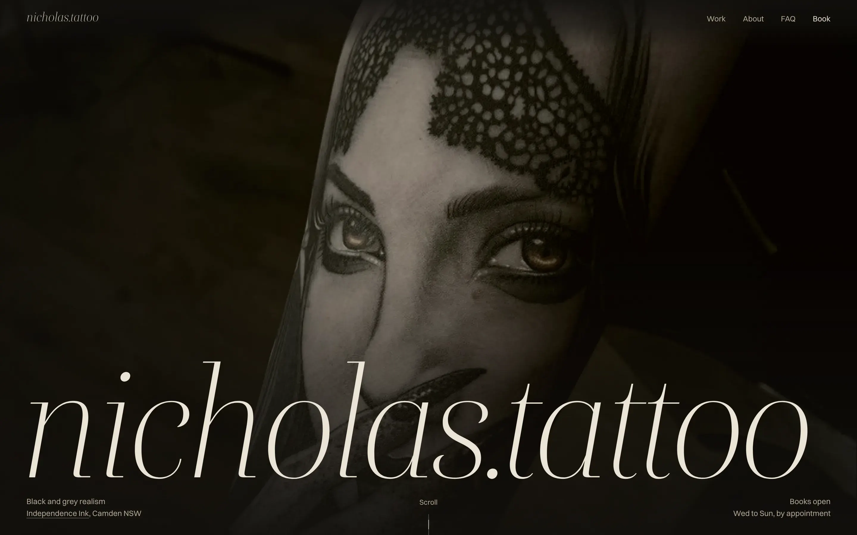
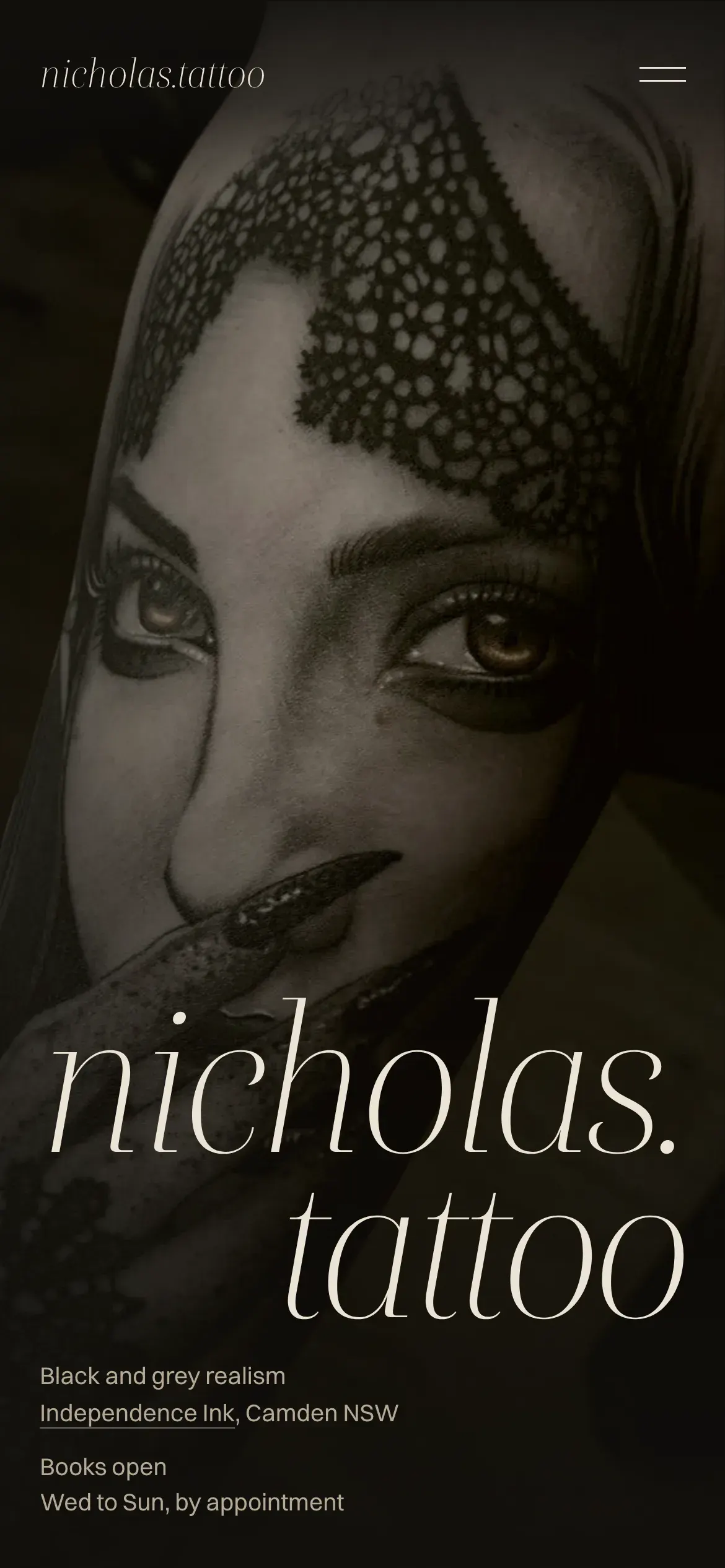
Warm near-black, a light italic serif, and his photos up front. It's meant to feel nothing like the studio site, which is cold black and white and heavy on condensed type.
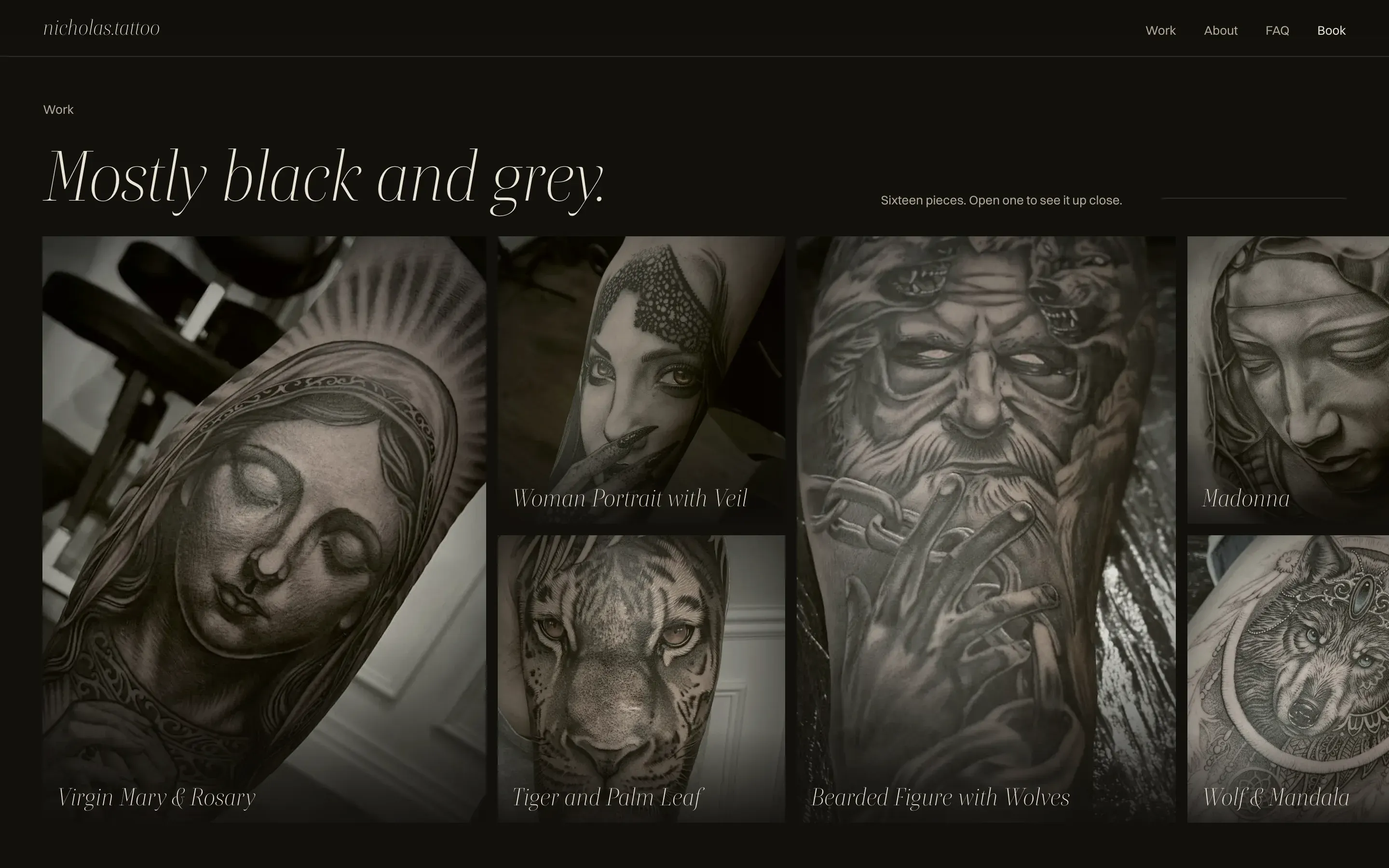
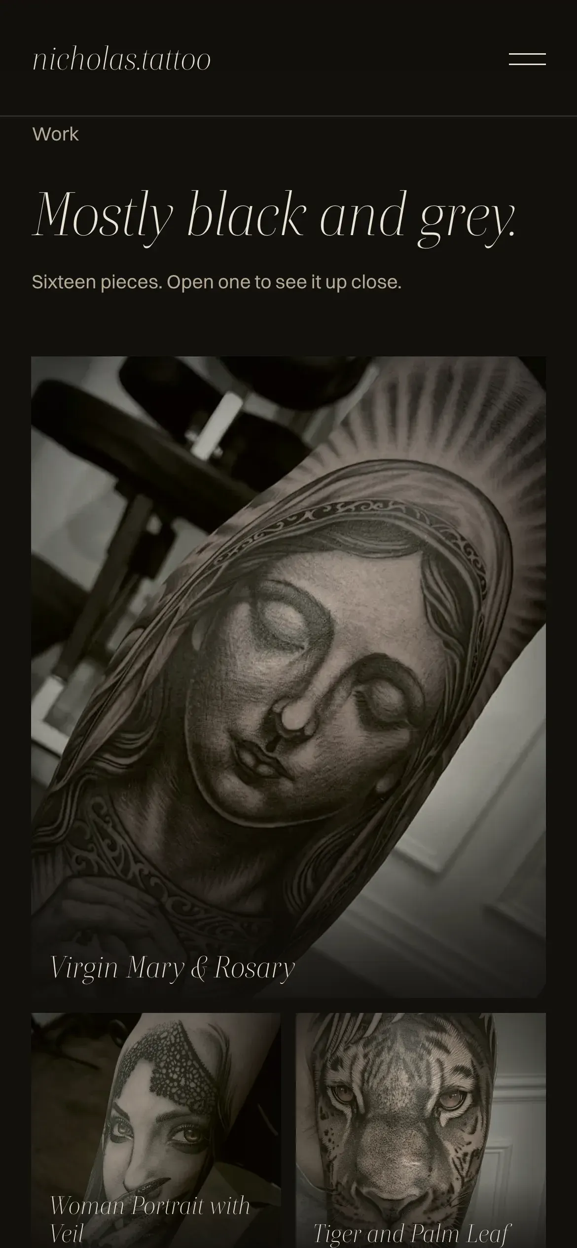
The work wall pans sideways and opens each piece full screen. Below it sit an about section, an FAQ and a booking form that asks for placement, size and timing up front.
Colour
Nick's realism is black ink and grey wash, with bare skin left as the highlight. In his best pieces the only colour is in the eyes. The site works the same way: warm near-black for the ink, bone for the skin, and brass, picked from the amber eyes in the veil portrait, as the one warm light. We tried oxblood first, but it failed text contrast on the dark background.
- Ink#12100DThe page
- Bone#EBE3D5Text
- Bone, quiet#B5AA98Captions and labels
- Brass#C19A5BThe one accent, once per screen at most
Type
Mostly black and grey.
Boska His name and the headings, in light italic
A thin, high-contrast serif, set huge against tiny text. It's the opposite of the studio site's heavy condensed capitals, so Nick's site reads as his own.
Sixteen pieces. Open one to see it up close.
Switzer Navigation, captions and the form
Small and plain. Everything apart from the work stays tiny and pinned to the edges, so one piece owns the screen.